Better by Design
There might be a subtle similarity, but you can rest assured that at some stage there will be comparison. If truth were told, it’s one issue that completely irritates me as a brand founder, and somewhat of a designer myself. I find it incredibly frustrating that people can’t or won’t accept that you can never redesign a wheel. It’s a perfect circle with no room for improvement.
Having this in mind we tend to go by the principle that if a case has been created, that in our view is all but perfect in size and proportion, it would be foolish to do anything other than dress that metaphoric wheel. In other words, whilst we can’t improve the shape, we can certainly look at the trim.
We knew we could improve the look of a wheel, or case in this instance, by changing the (trim), dial, hands, markers, bezel and even crown. All of these aspects can be worked on with artistic flair, and it’s what we do. We go through thousands of watch designs and images to do our utmost to avoid overly conflicting with existing designs, and in truth this was hugely time consuming. But as said in other sections of the site, we spent years researching before we even considered creating a timepiece.
So where do we start?
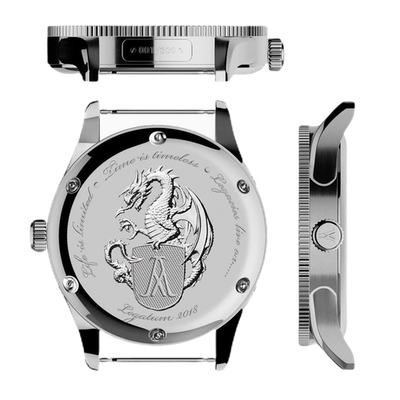
In this case, (no pun intended), it was from back to front. We already had a view in mind of what brand model we’d take inspiration from for our first piece, so it was more important to us to pay a bit more detail to the back-case first. We wanted to use it as real estate to tell the story of what we, or in truth, I, wanted to say. This was fairly easy for me. I wanted to create a legacy. Something to live long after I’d gone. Have in mind that at the time of design I had very little knowledge where my brain tumour was taking me. Diagnosis was and still is vague, treatment unknown.

It was there I started to reflect on my life. I looked at my heritage, my history. I was born in Wolfenbeutal in the Lower Saxony region of Germany. I’d spent my early years there. The brand name itself depicts that. So where did the dragon come from? Well, at an early age my family moved to Wales in the UK, and it was there I spent many happy years. The dragon is synonymous with the country and for me it was unthinkable not to pay tribute to it.
I then moved to the strap-line. Ironically it was the easiest part. I’m passionate about my legacy, and with a degree in professional writing I had little trouble thinking of the obvious. This being, ”Life is Limited,”, “Time is Timeless,“ and “Legacies Live On.” It just worked. It’s probably the only thing I didn’t really have to draft and redraft! By now I’d teamed up with some pretty experienced watchmakers who had a fair amount of experience in creating some great timepieces and was easy to brainstorm with. Being from a wide range of countries they also had anarray of heritage. Everything seemed to fall into place.
We’ll go on to cover more about our relationships at another time, but for now we’ll focus on where I left off— the design. The back was pretty much done in short order, so it was the case and furnishings that needed our attention. I was a fan of Breitling, and particularly liked the simple design of the super-ocean heritage. But I didn’t want to copy it. I wanted to resemble it—but not so much so that it would be called a homage. It wasn’t, it had to be sufficiently different. It was here that I benefitted from Peters’ Eastern European style. He’s well known for hard designs, industrial even. This worked for me.
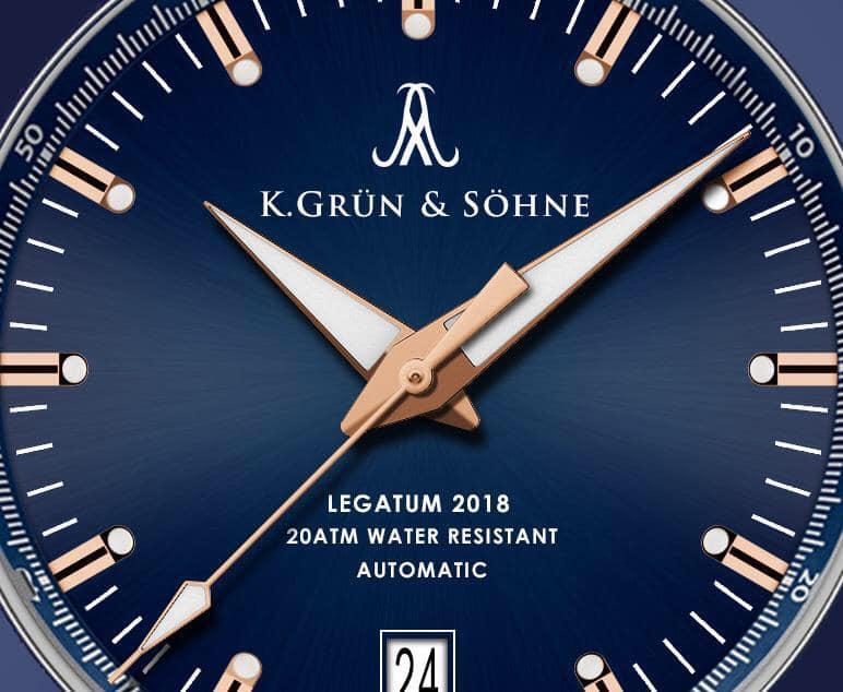
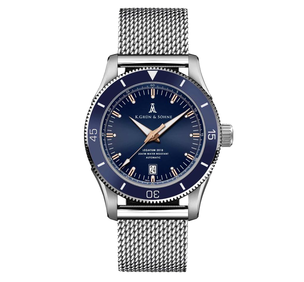 We decided to use a flat ceramic bezel as opposed to Breitlings’ tapered one. That for me instantly differentiated the two. That said, we studied everything from the case, lugs, dial and indices. We’d even made sure we’d have a vastly differing blue, a blue that wasn’t hard matt. We chose to go with a sunburst dial that popped at every angle. Our indices were far more intricate, less “diveresk.” The choice of Gold instead of silver, complimented by gold edged hands again gave difference. In short, we completely overhauled the design so popular with watch enthusiast.
Again, we aren’t going to shy away from the fact that we took inspiration. For us the petty cries of homage by die-hard fans of Breitling would cry foul regardless of what levels we went to. The watch industry is a fickle world, enthusiasts strange breed. I should know, I’m one of them. But Peter and I were satisfied that what we’d created, with a fair amount of input by many peers, was sufficiently different to give it its own DNA. It owns its own presence.
Talking about presence we had to think of a logo that would befit what we’re trying to achieve. The brand revolved around a legacy, one you can read more about here. We wanted the logo to represent our desire to to create a legacy intent on raising awareness and funds for brain tumours and cancer research. It was then we turned to the globally recognised cancer ribbon. But we couldn’t use that standalone. For one, the colours are so wide in range that it would be prohibitive. We had to come up with another plan.
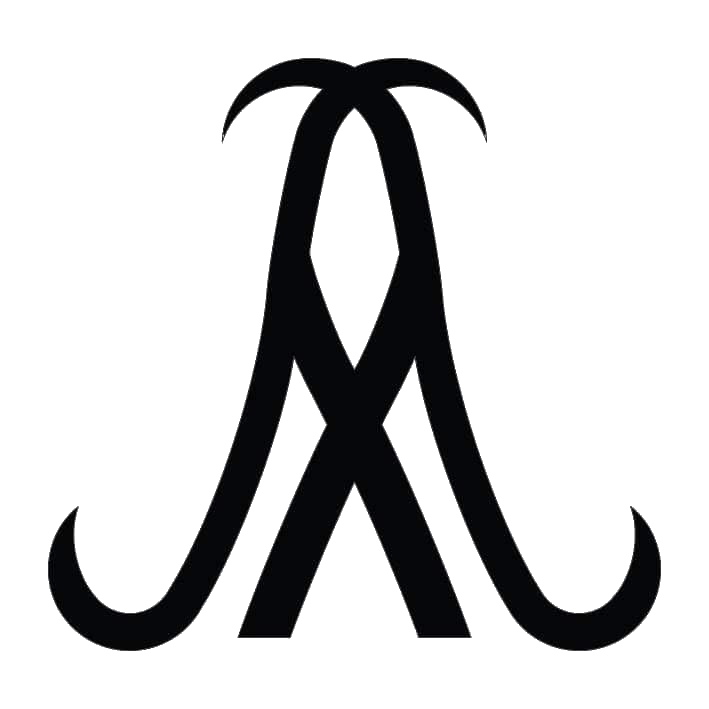
As the primary ideas man I looked at virtually every Greek letter I could. After all, if it was good enough for Omega and others, it was good enough for us. But it wasn’t quite that easy. Nothing seemed to fit. Either the letters had been used, or they just didn’t look right on a dial. It was then I toyed with the lambda symbol. It was an intriguing delve into a pool of information. From mathematics to human rights, the symbol had many meanings. In truth there’s no absolute behind choosing it and then mirror image but if I was to try and explain it I’d lean to it being chosen as a tribute to someone dear to my heart who’s saved my life so many times.
The irony wasn’t lost that this person also suffered from cancer on two occasions, yet despite this has put himself second to help others. He doesn’t know I chose it as my way of expressing my eternal gratitude and admiration for him even though he possesses one of our timepieces I gifted him. I’m sure he’ll get to read this and hopefully he’ll get to realise just how important this man is and always will be in my life. So there you go. A brief story about our design process. From the logo to the strap line, they all have a deep meaning. The tribute won’t ever be hidden, why? Because I recognise that there is no better way than showing respect than to pay tribute.
Click here to go home.